
Venmo Redesign
What's the Story?
Venmo is a mobile payment app for friends and people you know. This redesign was my critique and visual refresh for the app in 2017. Venmo was an app I used pretty often. Friend groups often use it, and it's a handy tool for going out and having fun. However, in 2017 there was a lot to be desired.
Objective
Modernize the app's visual design and interview users to address UX pain points. Reorganize features out of an overburdened menu, as well as rethink social interactions. I aimed to reconsider each feature and reprioritize what mattered to other Venmo users I interviewed.

A Critique Of What Was
Planning Process
The project's primary catalyst was to rethink Venmo's main navigation. So I started using Venmo with a critical eye to find out how easy it was to do the essential things: send money to people, receive money from them, and transfer money to your bank. Nowadays, Venmo does much more to give you a reason to keep your cash inside of Venmo, like offering credit, debit, and cryptocurrency. But I just started wireframing the flows for optimizing a few primary goals.

Reorganized Features
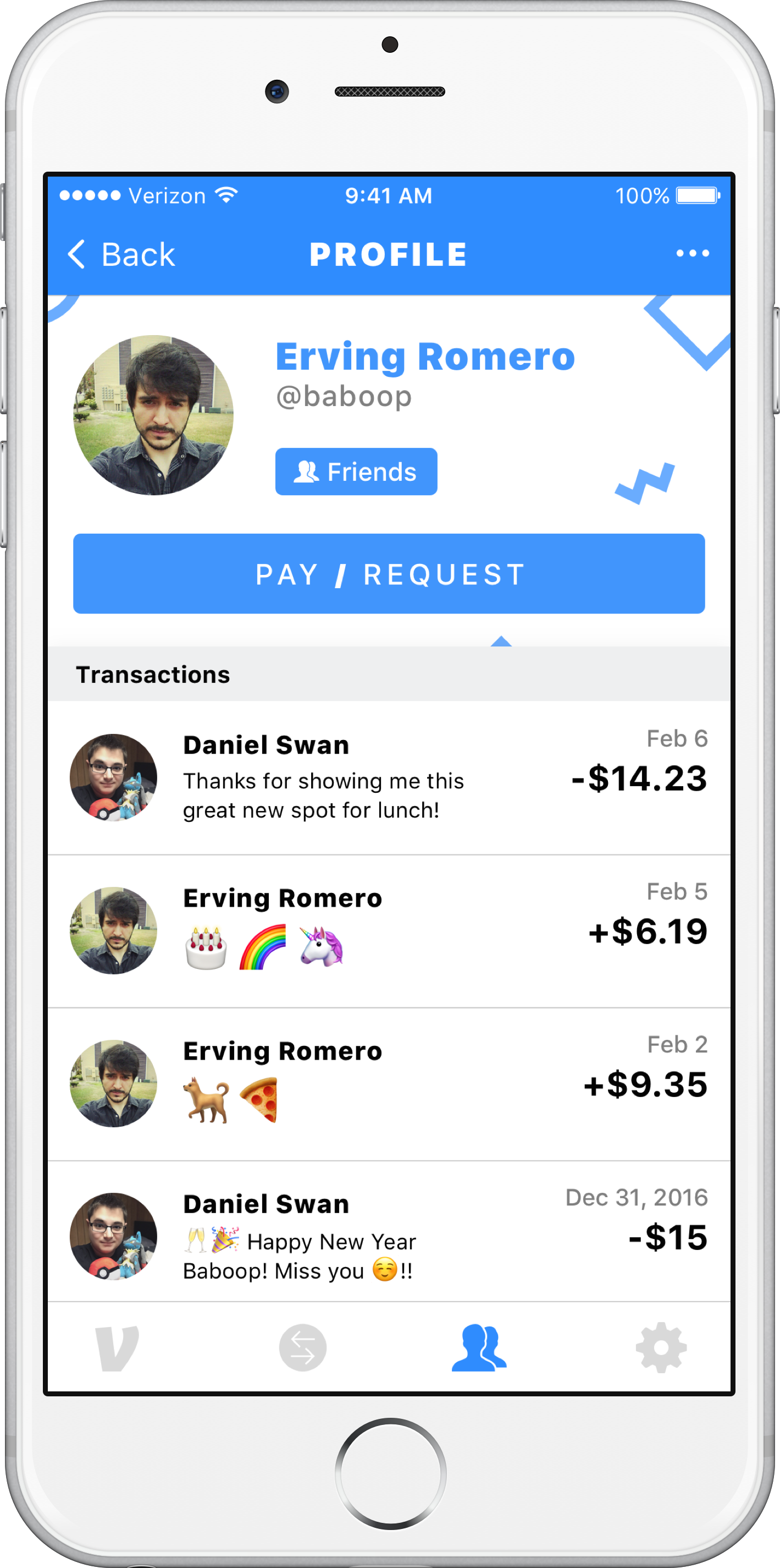
Many of the features in the original sidebar needed to be combined. Some on the list were so similar that dividing them confused and split focus. For example, screens relating to transactions like “Home, Purchases, and Incomplete” could be merged into one cohesive transaction timeline where it can be easier to understand all transactions can be found in one place. Combining and reorganizing the features, I simplified ten list items into four tabs.

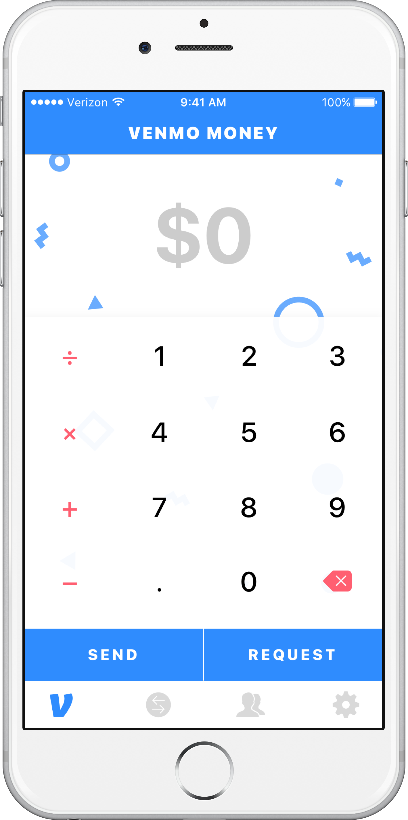
Putting Payments First
I redesigned the new home to prioritize the user's needs first. Instead of making the home screen self-promotion that Venmo has active users, I made the pay and request flow the home screen itself.

Shorter Pay Flow
Putting payments first became more convenient for making faster payments. This also helped people stay focused on their opening intent. The revised flow I made streamlined the pay/request process from a minimum of six steps to four.

Project Results & Retrospective
I could have redesigned the whole app experience if I had the time. This was meant to be a more petite critique as an exercise for my previous portfolio. There was a lot that I couldn't cover and, of course, a lot of interactions that I couldn't detail because I was working on this from the outside for a weekend rather than being on staff for months or years.
Regardless, the things I tackled in the exercise were actual user pain points of the app for the time. People even mentioned it was difficult to teach some parents how to move money around, making it a non-viable option for certain families. After years, I still think it was a good critique of how the app was then.
If I were to do it all again, I could probably have covered more ground, like split payments. I could have gotten into integrating ideas that, if Venmo was an experience about exchanging between people you know, personalization and expression could bring joy to the idea of repaying and covering each other. That would probably be a more impactful social feature than showing strangers paying each other for coffee.
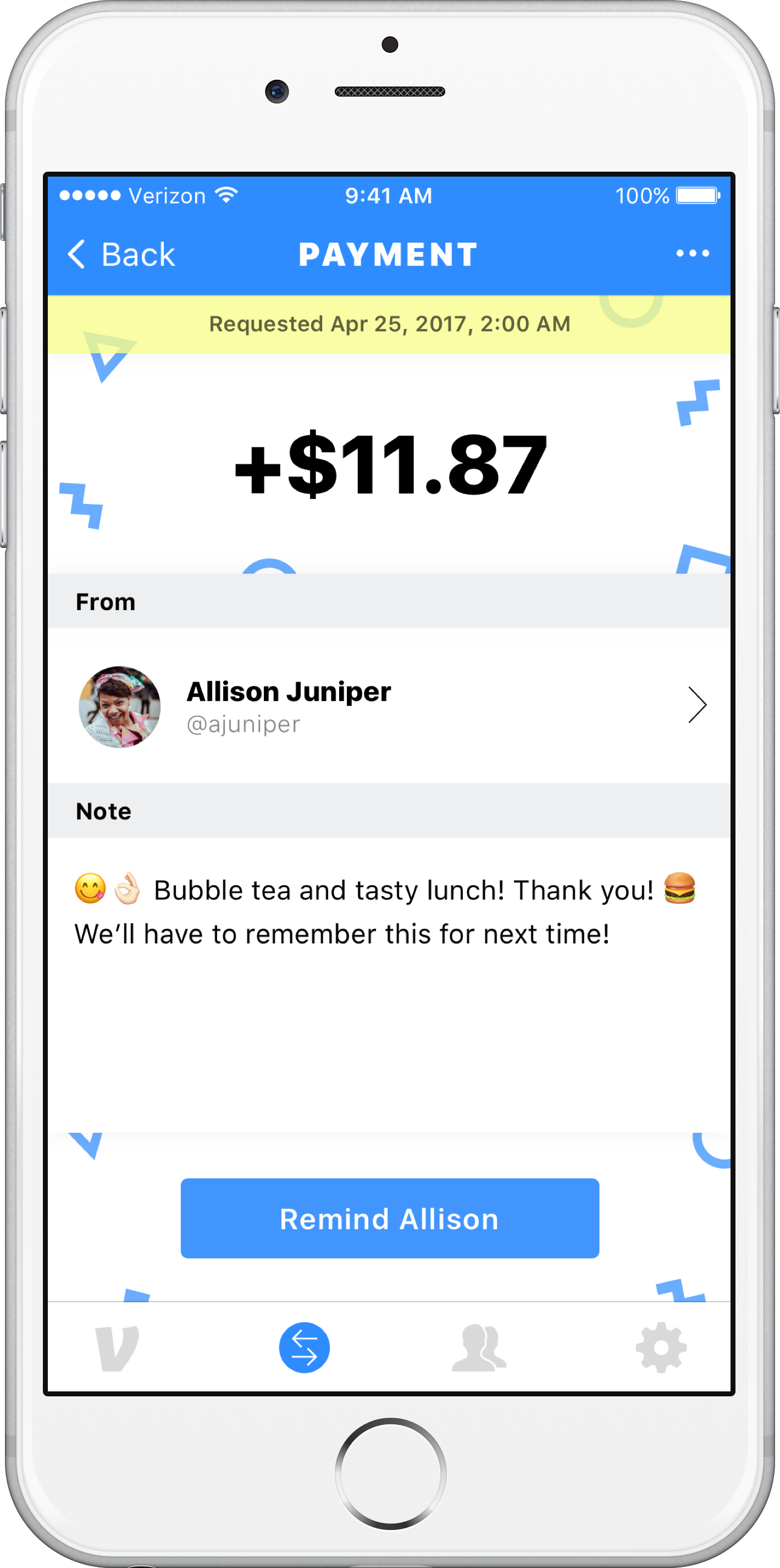
I'd also get into troubleshooting how to encourage peaceful dispute resolutions between people when a request is left hanging. You might see some of this in close-up screenshots in the project's download.
Project Screenshots
My 2017 visual design for this is now pretty dated in today's landscape. I know you see that's an iPhone 6, basically a fossil now! The actual app's design has changed and improved since. However, to put this whole project in context, back then, they only did a couple of main things while hiding most of it in an unorganized menu drawer.
I took note of everything that added friction to the participants using Venmo. Then I worked on reorganizing the navigation to cut down the steps to do those critical tasks. This involved reducing the number of options by grouping the more minor features into more sensible places within their relevant significant features based on what participants said.
Venmo added many features over the years, but their navigation was not scaling. New features were being added to the over-cluttered drawer list. Treating everything as equally important instead of based on where users expect features should live when most are trying to accomplish some goals more than others.
The biggest problem I found was, for more casual users who used Venmo only 1-3 times a month, pay & request was hidden in a corner. Instead, the home would urge you to look at a social network of strangers' financial business that, when asked, didn't care about. This left, especially new and less tech-savvy users, confused and lost when sending and requesting a payment.